How to change the color of placeholder attribute text of input element?

The CSS3 Placeholder Pseudo-element

The CSS3 Placeholder Pseudo-element


One of the features of HTML5 that was very quickly adapted by the developers around the globe and almost all the browsers developed since then, was “placeholder” attribute in input element. People stopped using javascript snippet in their code with onclick and onblur events.

Basically, placeholder attribute is used for displaying placeholder (informative) text in input fields, which fades away as soon as something is typed in the input box.

The placeholder-text is always faded (has opacity less than 1 = light in color) as compared to the original value text of input box. So, I was looking for a way to change the text-styling for the placeholder-text.

The latest ::input-placeholder CSS pseudo-element gives us a standards-compliant way to style placeholder text, regardless of an input field’s default styles. However most of the browsers have started to implement it but still it is preferred to use prefixed notations for each browser.

Example :

input {
	padding: 0px 15px;
	width: 300px;
	height: 30px;
	border: 1px solid #555;
	box-shadow: inset 1px 1px 1px 1px #000;
	border-radius: 5px;
	background: #666;
	font-size: 14px;
	color: #fff;
	text-shadow: 0px 1px 1px #000;
}
input::-webkit-input-placeholder {
	color: rgba(255,0,255,1); /* white color with alpha = 1 (alpha = opacity varies on a scale of 0 to 1 with decimal values in between) */
	text-transform: capitalize;
	font-size: 12px;
	font-style: italic;
	font-weight: normal;
	letter-spacing: 0.1em;
	line-height: 18px;
	padding: 0px 10px;
	text-align: left;
	text-decoration: underline;  /* blink property doesn't work in chrome right now */
}
input::-moz-placeholder {
	color: rgba(255,0,255,1);
	text-transform: capitalize;
	font-size: 12px;
	font-style: italic;
	font-weight: normal;
	letter-spacing: 0.1em;
	line-height: 25px;
	padding: 0px 10px;
	text-align: left;
	text-decoration: blink;
}
input:-moz-placeholder {   /* Older versions of Firefox */
	color: rgba(255,0,255,1);    /* alpha property doesn't properly work Firefox */
	text-transform: capitalize;
	font-size: 12px;
	font-style: italic;
	font-weight: normal;
	letter-spacing: 0.1em;
	line-height: 18px;
	padding: 0px 10px;
	text-align: left;
	text-decoration: blink;
}
input:-ms-input-placeholder { 
	color: rgba(255,0,255,1);
	text-transform: capitalize;
	font-size: 12px;
	font-style: italic;
	font-weight: normal;
	letter-spacing: 0.1em;
	line-height: 18px;
	padding: 0px 10px;
	text-align: left;
	text-decoration: blink;
}
How to fix the Twitter Bootstrap Modal box height and width with central position?

img2


Recently, while working on a web-portal which has lots of modal boxes to keep the constant flow of information, I encountered an issue of keeping the position of modal boxes in the center of the page while changing the height and width of the modal box specifically as per the modal-box ID.

The solution for this fix was achieved by tweaking in the CSS specifically on the basis of ID’s.

Height fix

If you want to accommodate long form of elements in the modal box and do not want the scroll-bar to appear, set your css as following:

#newModalID .modal-body {
max-height: 800px;
}

Remember that the max-height has to be given only for the modal-body and not the whole modal box. Another thing to be noticed is that, it doesn’t set the height to 800px but it just gives the flexibility to the .modal-body element to stretch up to 800px so as to accommodate anything without scroll-bar.

Width fix

Now, while setting the width you can deal directly with the whole modal-box not just the .modal-body element. Set the width as per your choice for any specific modal-box. Then, you can change the margin accordingly to accommodate the new width.

#newModalID {
	width: 900px; /* SET THE WIDTH OF THE MODAL */
	margin: -250px 0 0 -450px; /* CHANGE MARGINS TO ACCOMMODATE THE NEW WIDTH (original = margin: -250px 0 0 -280px;) */
}

Remember that you have to set the left margin – half of width (here: 900/2 = 450) and as a negative integer.

To fix the vertical position, you have to simply modify the margins to get the desired effect. Often when you change the height of a modal you may want to push the modal up to prevent the modal going off the bottom of the page on smaller resolutions, so you can simply increase the negative top margin value:

#newModalID {
	margin: -120px 0 0 -450px; /* PLAY WITH THE VALUES TO SEE GET THE DESIRED EFFECT */
}

Two Favorite CSS4 selectors – :not() and :matches()

matches-and-not-css4-selectors

In the CSS4 Specification it says :not() can be used for both selectors and pseudo classes. It will not work with:after or :before, but everything else works great. So lets say you want to apply to everything except links.

*|*:not(:link) {
/* Some CSS */
}

in the code snippet above, *|* is a general “apply to everything” rule. Basically it’ll apply the CSS to all the elements. But here css would be applied to all except the links.

So, the negation pseudo-class, :not(X), is a functional notation taking a selector list as an argument. It represents an element that is not represented by its argument.

NOTE: Negations may not be nested within itself or within :matches(). That means :not(:not(…)) and :matches(:not(…)) are invalid.

Pseudo-elements cannot be represented by the negation pseudo-class; they are not valid within :not().

Now coming over to :matches.

In this example, we condense three rules with identical declarations into one. Thus,

h1 { font-family: sans-serif }
h2 { font-family: sans-serif }
h3 { font-family: sans-serif }

is equivalent to:

h1, h2, h3 { font-family: sans-serif }

The matches-any pseudo-class, :matches(X), is a functional notation taking a selector list as its argument. It represents an element that is represented by its argument.
In CSS4, only compound selectors are allowed within :matches(): combinators are not allowed. Additionally, :matches() may not be nested within itself or within :not(). :matches(:matches(…)) and :not(:matches(…)) are invalid.
Pseudo-elements cannot be represented by the matches-any pseudo-class; they are not valid within :matches().
Default namespace declarations do not affect the subject of any selector within a matches-any pseudo-class unless the argument is an explicit universal selector or a type selector.

For example, following selector matches any element that is being hovered or focused, regardless of its namespace. In particular, it is not limited to only matching elements in the default namespace that are being hovered or focused.

*|*:matches(:hover, :focus)

The following selector, however, represents only hovered or focused elements that are in the default namespace, because it uses an explicit universal selector within the :matches() notation:

*|*:matches(*:hover, *:focus)

CSS4

css4


First of all I would like to start with that there has never been anything like CSS4.
It’s the development of independent modules published after CSS 2.1.

To be more precise and accurate, we might like to explore the content from the following post.
A Word About CSS4

But still in order to explore the latest so called CSS4, we can discuss about the latest selectors that have been developed so as to ease the pain of using javascript / jQuery extensively.

First nice feature I would be discussing would be giving styles to the parent element based on its child element. Consider the following line:

ul > li:hover {color:#ff0000;}

Here li is a child element and ul is a parent element. So, here the color of li will change when list item is hovered.
Introducing the “$” in the syntax. This allows for styling of a parent element (‘ul’ here) based on its child element (‘li’ here). See the example below:

$ul li:hover {color:green;}

Here, if one hovers over a list element, the whole list will turn green. This is a great and dearly needed feature.

Kindly refer to further posts coming in near future to know more features.

CSS Hacks for IE6, IE7, IE8, IE9

Older versions of IE has been one of the biggest issues in the past. But the time demands us to move on. Still some of the css hacks are handful to know what you can technically get away with, whether it be for debugging, or showing off to your friends!

First thing first, use of conditional statements in the css. For example,

<!--[if lte IE 8]>
Make IE8 or less than IE8 happy.
<![endif]-->

We could have written “[if IE 8]” to just specifically target IE8.
Here are different types of conditional symbols. Like,

lt
less than
gt
greater than
lte
less than or equal to
gte
greater than or equal to
!
not equal to

It should be used most of the times when you have more than 2-3 lines of fixes for a particular browser. While if you have 1-2 issues in a certain browser, I would suggest you to use the following css hacks.

css-hacks-for-older-browsers

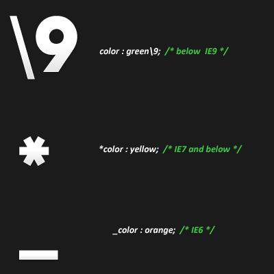
IE6 – underscore hack (_)

Example:

p {
color: red; /* all browsers, of course */
_color : orange; /* IE6 */

IE7 and Below – Asterisk symbol (*)

Example:

p {
color: red; /* all browsers, of course */
*color : yellow; /* IE7 and below */

IE8 and Below – append “\9″ to end of style (\9)

Example:

p {
color: red; /* all browsers, of course */
color : green\9; /* IE8 and below */

Is it good to convert the HTML / XHTML website into HTML5 website?

One of my client asked me that “If he should spent money to re-factor his e-commerce website to HTML5 , will it add any benefit to his e-commerce business?” Many of you might have the same query running in your minds.
He still has a good number of users from IE6. And he don’t want to compromise on performance too for IE users just to use HTML5. So, should we skip the re factoring idea for now or there are some real benefits which can be beneficial for website and it’s users by using HTML5?

The answer is HTML5 is aimed to improve inclusiveness and accessibility. The more we develop in HTML5 the more we ensure it’s continued development and browser adoption.

There are a lot of benefits of using HTML5. HTML5 doesn’t have a zero day of when it began and what point it should be used – Its just there.
To my opinion, first and foremost one should keep in mind to “never change a running system – everything at once”. It should be used on a case by case basis. Indeed IE6 isn’t completely dead and the newer versions of IE don’t properly support it so that’s a lot of people to consider. What exactly differs in HTML5 to (X)HTML1.0? It’s mostly about Graphics Primitives, Local Storage and the like. Nothing that couldn’t be achieved by current standards. And that’s what HTML5 is not (yet). It is still a work in progress and a lot of the features are still under development or don’t have browser support (see http://caniuse.com/).

It gives cleaner and more readable code when you consider some of the new elements (article, summery, header etc.). HTML5 has some real multimedia benefits especially for displaying audio/video on mobile devices but also for displaying vector graphics and MathML (it all depends on the client though!). So it might be better to completely redesign the clients’ site with the goal of using HTML5 instead of trying to refactor the current site.  We may have to use a JavaScript library, such as HTML5Shiv, to maintain support for IE6.

It will take longer to account and develop for older browsers now but moving forward we will be able to provide many additional benefits. For instance, mobile and tablets may be what tips the scale for us. So it is necessary to check the analytic/statistics on the number of old browsers versus the number of new browsers/mobiles/tablets and pay close attention to how they are trending. It is essential to determine if the user base is national or worldwide. Usually when we have huge user base then all older IE (8 down) is on the decline and IE9+, all other modern browsers(webkit, mozilla, etc) and mobile users are on the rise. The reason the older versions are now facing obsolescence is because they were too limiting and exclusive.